As a B2B content strategist, it’s your job to connect with prospects, finding ways to gain their trust in order to convert them into paying customers. One way to do this is by creating an About Us page that effectively and authentically shares your company story—including your mission and core values, and how your products and services benefit your customers.
After all, B2B About Us pages get a lot of attention. According to one survey, 52 percent of respondents said they wanted to see About Us information as soon as they hit a B2B company’s homepage.
If your About Us page consistently ranks among the top 10 most-visited pages—and we’re betting it does—then read on to learn more about:
- 7 About Us page best practices
- 8 About Us page examples, including what they do well—and what they don’t
- How to take your B2B About Us page to the next level
7 Best Practices for B2B Pages
The goal of your B2B About Us page isn’t to make a sale. Instead, the focus should be on building trust and credibility with your target audience. Highlight your mission, beliefs, value proposition, and key differentiators. And in every case, show how they support and relate to your prospects and customers. That said, keep the following About Us page best practices top of mind as you create your B2B About Us page:
- Showcase your brand voice and identity. The best B2B About Us pages apply a consistent brand voice in both copy and visual design to effectively communicate a company’s brand personality and core values, and convey how it stands out from the competition.
- Inspire, empower, and connect with your audience. An About Us page that takes a company-centric approach, only talking about who you are and what you do, will fail to resonate with your users. Make sure to connect your mission, vision, and values with tangible—and exciting—solutions that address your customers’ needs and challenges.
- Ensure a cohesive content progression. Structure About Us content so that the most important information is up front and your page content follows a natural narrative arc. Lead with messaging that clearly shares your customer-focused mission and value prop. Include a brief company story only if it’s truly unique and will strike a chord with visitors. This is when a content model can come in handy.
- Employ clear, concise, compelling copy. Use descriptive language that embodies your brand voice and tone. Succinct, snappy eyebrows, headlines, paragraphs, and CTAs—both short-form and microcopy—that use the second person (you, your) will grab your visitors’ attention much more so than generalized, long-form text will.
- Provide helpful links to relevant supporting content/pages. Don’t try to say it all on a single page; TMI (too much information) can overwhelm and confuse your visitors. Avoid cognitive overload by providing the key point or theme on your About Us page, then supplying a link to more information for visitors who want to dig deeper.
- Include content that persuades and validates. Rather than just telling visitors what you do and how well you do it, show them via noteworthy stats and figures, awards and other recognition, and customer testimonials. Consider featuring a brief video, blog posts, or news that help explain how customers benefit from your company.
- Apply an engaging, on-brand visual design. To further connect and delight visitors, include colors or color blocking, polished photos (human-centric if possible), iconography, illustrations, and micro-animations or other interactive elements in keeping with your brand. Visually engaging, or immersive, content experiences can improve engagement as much as 252 percent.
B2B Page Examples
In searching for the best B2B About Us pages, I found some great About Us examples—and others that still had room for improvement. Most of the About Us page examples included here are B2B, though a couple serve B2C audiences. Their inclusion is intentional. That’s because B2B audiences spend time on B2C sites and platforms, which push the creative bounds and elevate expectations for a delightful, customer-focused UX.
Take a look at what the following About Us page examples do well—and what they don’t, based on the best practices covered above. And use what you learn to enhance your own B2B About Us page.
Zendesk About Us Page
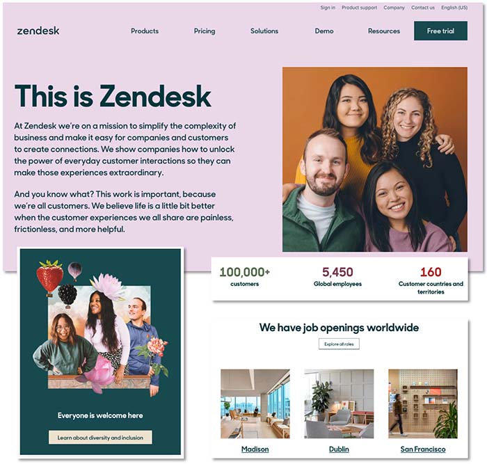
What Zendesk Does Well
- Clearly conveys value prop and mission with easy-to-understand, approachable hero copy.
- Effective content hierarchy—front-loaded with the most important information.
- Engaging, on-brand UX:
- Good mix of short-form and micro copy
- Clear and actionable heads, subheads, and CTAs
- Good use of crisp/polished photos, colors, color blocking, and graphic art
- Includes helpful, relevant sections with links to learn more.
- Good use of persuasive proof points.
What It Doesn’t Do Well
- Missed opportunity to learn more by including link to “What is Zendesk?” page.
- Lacks interactive elements (in keeping with brand expression across the rest of the website).
Mailchimp About Us Page
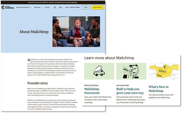
What Mailchimp Does Well
- Builds credible brand narrative with founder story targeting SMBs.
- Emphasizes value prop as an “alternative to expensive email software.”
- Highlights values via culture and corporate citizenship sections.
- Simple and straightforward layout.
- On-brand imagery, copy, and colors.
- Links to relevant content.
What It Doesn’t Do Well
- Missed opportunity to include key messaging in the hero section.
- Includes dense copy blocks that are hard to scan and digest.
- Body of page lacks engaging imagery or interactive elements employed in other areas of the website.
Buffer About Us Page
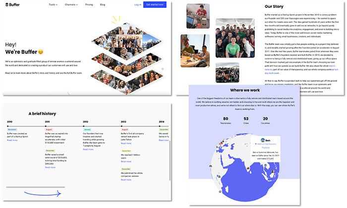
What Buffer Does Well
- Clearly communicates values (e.g., transparency).
- Flow of content from one section to the next.
- Lively, fun, personable content and imagery:
- Overall, a good mix of long- and short-form copy, heads, and subheads
- Good use of human-centric photos, colors, emojis, and microanimations
What It Doesn’t Do Well
- Lengthy company story that’s not easy to scan.
- Uses scrollbars within scrollbars (with timeline and global team), adding complexity to the UX.
- Over-reliance on a single page to tell/do it all.
- Lacks second person (you, your) usage to connect with visitors.
Asana About Us Page
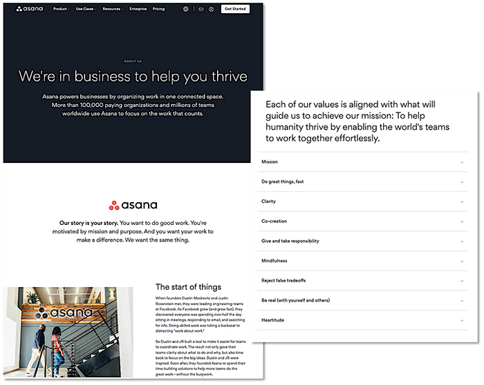
What Asana Does Well
- Clear, concise messaging (mission, value prop, proof points) in hero and second section.
- Liberal use of second person (you, your) to relate to visitors.
- Helpful, relevant links to learn more (about mission, culture, company, and diversity).
- Good use of accordions for better scannability.
What It Doesn’t Do Well
- Missing (additional) imagery, icons, color blocking, and/or interactive elements to provide visual relief for and further engage visitors.
- Lacks a concise company story and explanation of the word “asana” (in terms of relevance, the latter could be shortened drastically then moved down the page).
Vidyard About Us Page
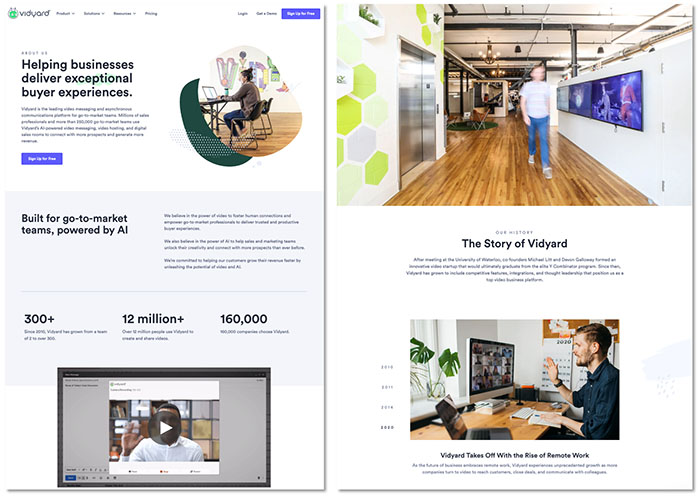
What Vidyard Does Well
- Clear messaging around mission and value prop.
- Cohesive narrative progression.
- On-brand and approachable UX:
- Good balance of short-form and microcopy
- Effective use of human-centric photos, colors, color blocking, and graphic art
- Unique and pithy “highlights” timeline (with just four, image-focused items).
- Short product explainer video (44 seconds).
- Good use of proof points.
What It Doesn’t Do Well
- Lacks links to other About Us/Company content.
- Somewhat lacking in diversity (of people featured in photos).
WordPress About Us Page
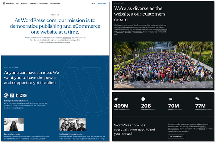
What WordPress Does Well
- Clear delivery of mission, value prop/benefits, and core values.
- Speaks directly to the user; generous use of second person (you, your).
- On-brand copy and design.
- Easily scannable and digestible messaging.
- Good use of proof points.
What It Doesn’t Do Well
- Includes inline links to external websites, which can derail users.
- Not as visually appealing as its product pages.
Roblox About Us Page
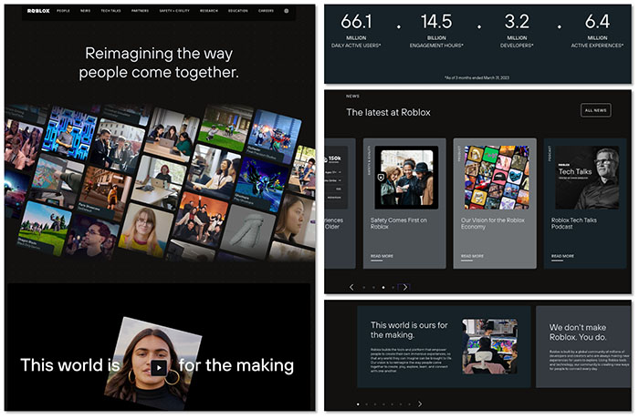
What Roblox Does Well
- Immersive, on-brand experience, which effectively conveys community, diversity, and dynamic interactions.
- Strong (inspiring, empowering, inclusive) messaging conveyed via one-minute video.
- Includes up-to-date proof points (noted with time stamp).
- Helpful links to relevant/related About content.
What It Doesn’t Do Well
- Explanation of what Roblox is falls well below the fold.
- A couple sections could use headers for better clarity.
Giphy About Us Page
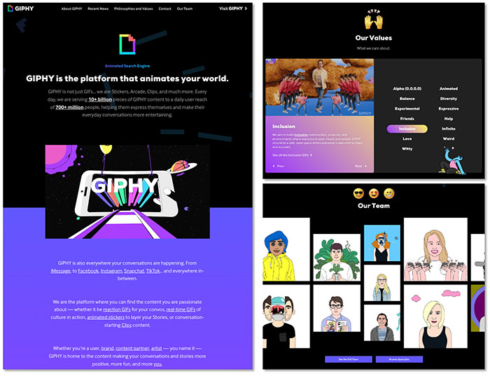
What Giphy Does Well
- UX that’s very much on-brand—with quirky, entertaining, animated eye candy to draw visitors in and elicit a reaction:
- Numerous fun visuals and interactive content
- Warm, humorous, user-centric messaging
- Proof points integrated into hero copy.
- Clever integration of Giphy products with Our Values section.
- Includes helpful links to relevant/related About content.
What It Doesn’t Do Well
- Copy in second section (below the hero) runs a bit long—but inline links trigger animated gifs, making reading fun and experiential.
Take Your B2B About Us Page to the Next Level with Tendo
Need more guidance on how to better connect and build trust with prospects via your About Us page? Tendo can help you review your current company page and provide recommendations as well as copy and design support to make sure it hits the mark. Contact us to learn more.


