

If your company sells products or services that are even moderately complex, you likely have an abundance of content resources—from spec sheets to installation tutorials—to help your customers use them successfully. When you add marketing content like case studies, white papers, and e-books, you’re often looking at hundreds or thousands of resources.
Do you need a resource center to house all of them? Most likely. While resources are always best served to your customers in context—as part of the primary content experience on a specific web page, for example—resource centers can serve as a secondary access point to information on a specific topic or product.
If you decide to build a resource center, it can be tempting to just toss all that content into a basic online repository and call it a day—but hold on. Resource center creation requires careful attention to information architecture, taxonomy, and user experience (UX) best practices. In a disorganized and hard-to-navigate resource center, critical documents may never get found and read, causing customers to click away in frustration.
Here are three best practices to follow when developing your B2B resource center, along with resource library examples for inspiration.
1. Base Navigation on User Needs
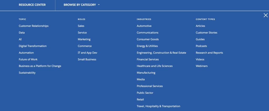
You might consider organizing the resource center by content format or marketing funnel—but your users are more likely to look for resources by role, topic, or industry. As with any content experience, you should think about what your users want, not what’s easiest for you. And since not everyone is after the same thing, it’s best to offer multiple ways to filter and navigate the resource center, so your users can find what they are looking for.
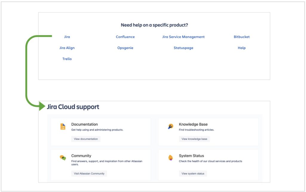
You don’t need to reinvent the wheel here. Atlassian knows that their users search for support resources by product—so that’s exactly how they built the navigation for Atlassian Support.
2. Guide the User
An unfiltered resource center can overwhelm your users, especially when the topics it covers are highly technical and complex. Luckily, there are many effective ways to guide visitors to the content they need. Visual design and page sections can highlight key resources and make content digestible, while well-placed copy can provide helpful context.
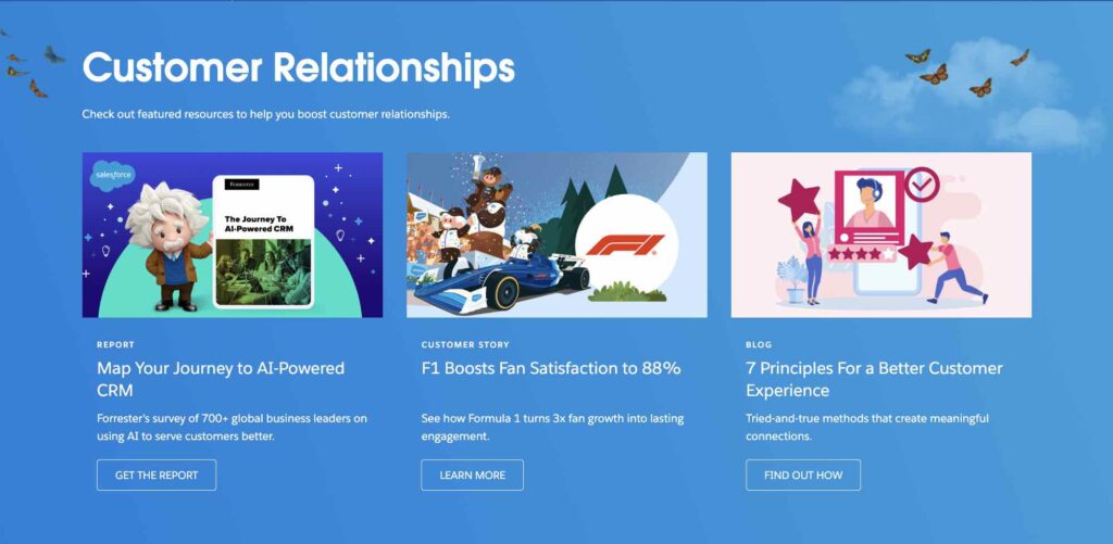
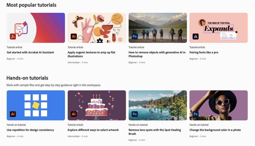
Instead of making the user sift through a long list of resources, the Salesforce Resource Center offers three featured resources at the top of each page. The example below shows customer relationship resources. But there are similar landing pages for other topics, as well as for different roles and industries, so that everyone gets guidance no matter what they’re looking for. Copy at the top of the page helps frame the resources while confirming that the customer is in the right place.
Pro tip: When a user navigates to your website’s resource center from another section, such as a product or industry page, pre-filter the results for that attribute or category to provide the resources that are most relevant.
3. Provide Context with Metadata
Including a brief description of each resource will help users decide what is relevant to their needs. A well-defined taxonomy that allows tagging by topic and content type helps narrow the list down further—especially when those tags are visible to the user. Adding images for topics and types can also catch the eye and help break things up visually as you’ll see below. You may even want to include the content length (e.g., “5-minute read”) for those looking for shorter material or longer, more in-depth technical resources.
Adobe Learn does a great job of this, with images and helpful descriptions for each resource, content type and skill level tags, and information on content length.
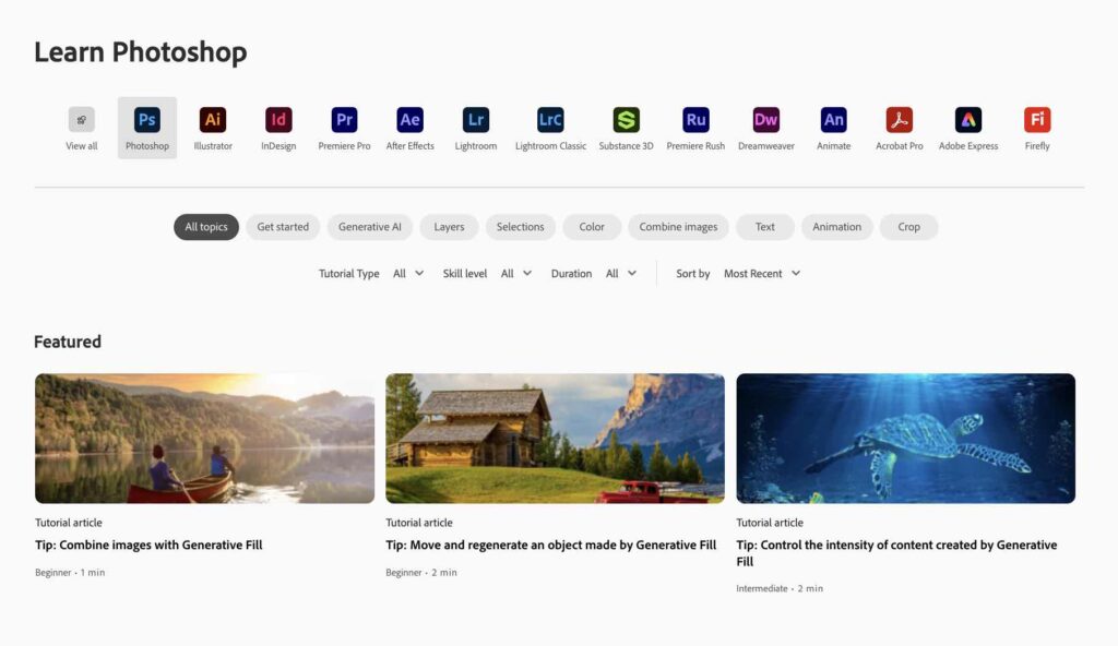
And it provides context for each resource before the user clicks through, further facilitating their path to finding their desired content and solution.
Your website’s resource center houses a wealth of content that can help your users do great things with your product—so don’t make it an afterthought. Use navigation, design, copy, and taxonomy to empower your customers by surfacing and promoting the most relevant and useful content for their needs.
Ready to Supercharge Your B2B Resource Center?
Tendo’s user experience team can help you develop or upgrade your resource center so that it supports and delights your users—just as we have for some of the world’s top B2B brands. Let us know what your needs and goals are. Get in touch today.
First published August 19, 2021